This section lists all available indicators. Base classes are not listed here.
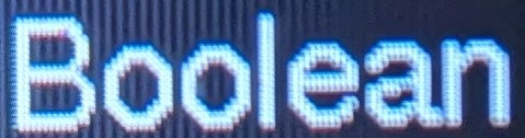
BoolIndicator
The BoolIndicator indicator can be used to display the value of an boolean variable. This indicator offers different style (classic "ON"/"OFF", LED).
- Supports children: No
- Supported key inputs: None
- Supported touch inputs: None
- Dynamic memory allocation: None
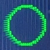
Led Style (off) | 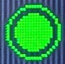
Led Style (on) |
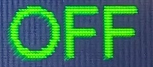
Classic Style (off) | 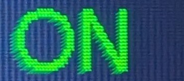
Classic Style (on) |
EnumIndicator
The EnumIndicator indicator can be used to display the value from an enumeration variable.
- Supports children: No
- Supported key inputs: None
- Supported touch inputs: None
- Dynamic memory allocation: None
Icon
The Icon indicator can be used to show an icon on the user interface. The icons must be in the .xbm format and located in the program memory (using the PROGMEM attribute).
- Supports children: No
- Supported key inputs: None
- Supported touch inputs: None
- Dynamic memory allocation: None
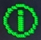
Label
The Label indicator can be used to show a string on the user interface. The Label supports multiline strings (containing line breaks) and different fonts.
- Supports children: No
- Supported key inputs: None
- Supported touch inputs: None
- Dynamic memory allocation (sum of the following sizes):
maxStringLength * sizeof(char)(Text)
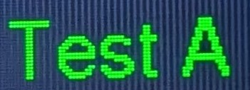
Label | 
Another label with another font |
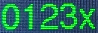
NumericIndicator
The NumericIndicator can be used to display the value of a numeric variable. The value is displayed in prefixed format if possible (e.g. 1000 is displayed as 1k)
- Supports children: No
- Supported key inputs: None
- Supported touch inputs: None
- Dynamic memory allocation (sum of the following sizes):
maxStringBufferLength * sizeof(char)(_stringDrawBuffer)
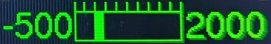
ProgressBar
The ProgressBar indicator can be used to display a progress bar. It supports different fill modes (origin left, origin right, origin zero) and ticks.
- Supports children: No
- Supported key inputs: None
- Supported touch inputs: None
- Dynamic memory allocation: None