This section lists all available controls. Base classes are not listed here.
BoolControl
The BoolControl can be used to toggle the value of an boolean variable. This control offers different style (classic "ON"/"OFF", toggle switch, check box).
- Supports children: No
- Supported key inputs:
- KEYOK to toggle the boolean value.
- Supported touch inputs:
- TOUCH_NORMAL: Toggle the boolean value (like KEYOK)
- Dynamic memory allocation: None

ToggleSwitch Style (off) | 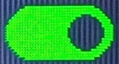
ToggleSwitch Style (on) |

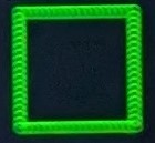
Classic Style (off) | 
Classic Style (on) |
Checkbox Style (off) | 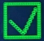
Checkbox Style (on) |
ButtonControl
The ButtonControl can be used to display a button that the user can press. When pressed, a callback function is executed.
- Supports children: No
- Supported key inputs:
- KEYOK to press the button and execute the callback function.
- Supported touch inputs:
- TOUCH_NORMAL: Press the button and execute the callback function (like KEYOK)
- Dynamic memory allocation (sum of the following sizes):
maxStringLength * sizeof(char)(_buttonText)
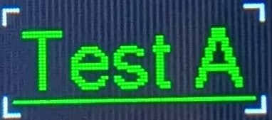
EnumControl
The EnumControl can be used to choose a value from an enumeration.
- Supports children: No
- Supported key inputs:
- Supported touch inputs:
- TOUCH_NORMAL in left half of control while in edit mode: Change to previous enumeration value (like KEYDOWN)
- TOUCH_NORMAL in right half of control while in edit mode: Change to next enumeration value (like KEYUP)
- TOUCH_LONG: Toggle between edit and display mode (like KEYOK)
- Dynamic memory allocation: None
EnumControl | 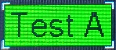
EnumControl in edit mode |
MessageDialog
The MessageDialog control can be used to show a message dialog including a severity icon (info, warning, error), a message text and 0, 1 or 2 buttons (OK, Cancel).
- Supports children: No
- Supported key inputs: The user inputs are internally redirected to the ContainerPage that is managing the buttons.
- Supported touch inputs: The touch inputs are internally redirected to the ContainerPage that is managing the buttons.
- Dynamic memory allocation (sum of the following sizes):
5 * sizeof(UIElement)(_page._items)5 * sizeof(PageItemConfig)(_page._itemConfiguration)maxMsgLength * sizeof(char)(_message.Text)3 * sizeof(char)(_buttonOk._buttonText)7 * sizeof(char)(_buttonCancel._buttonText)
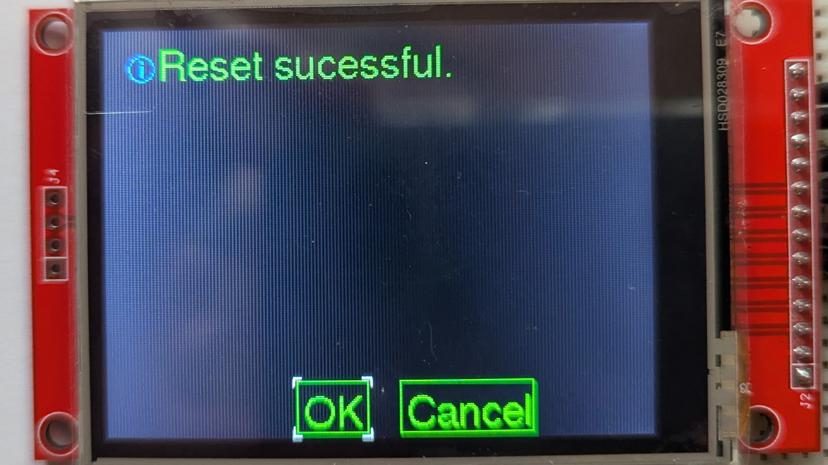
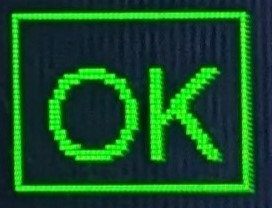
MessageDialog (info) | 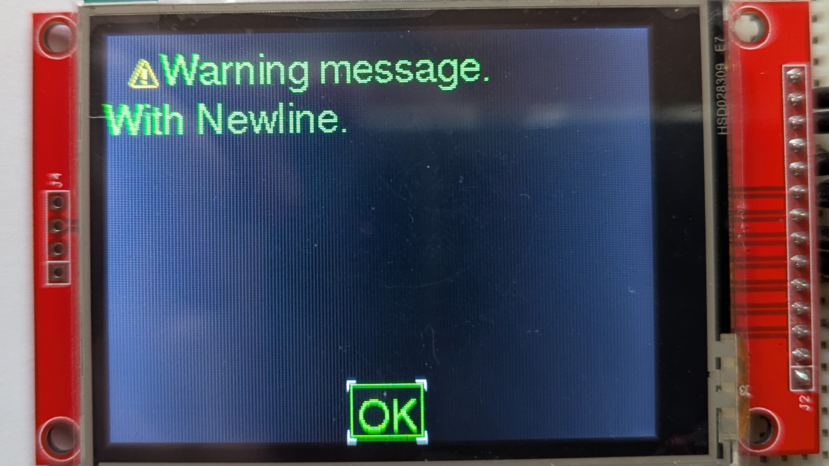
MessageDialog (warning) | 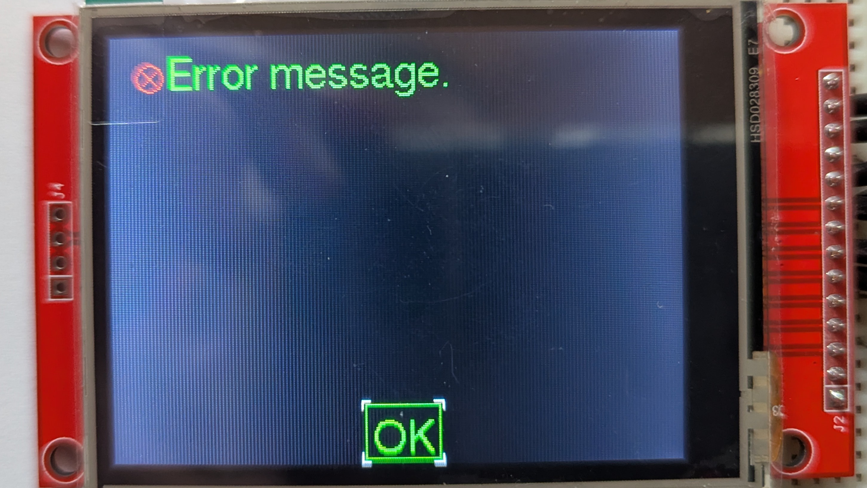
MessageDialog (error) |
NumericControl
The NumericControl can be used to change the value of a numeric variable.
- Supports children: No
- Supported key inputs:
- KEYOK to toggle between edit and display mode.
- KEYLEFT and KEYRIGHT to move the cursor left/right (only supported in edit mode).
- KEYUP and KEYDOWN to increase/decrease the digit at the cursor position (only supported in edit mode).
- KEYKILO, KEYMILLI to change to kilo (*1000) or milli (/1000) of the current value (only supported in edit mode).
- KEYX1 change to the base unit, *1 (only supported in edit mode).
- KEYMINUS to toggle from positive to negative value (only supported in edit mode).
- KEY0 to KEY9 to change the value of the digit at the cursor position to the corresponding value (only supported in edit mode).
- Supported touch inputs:
- TOUCH_NORMAL on left half of control (edit icon) while in edit mode: Open a virtual keypad to edit the control value like with key inputs
- TOUCH_LONG: Toggle between edit and display mode (like KEYOK)
- Dynamic memory allocation (sum of the following sizes):
maxStringBufferLength * sizeof(char)(_stringDrawBuffer)
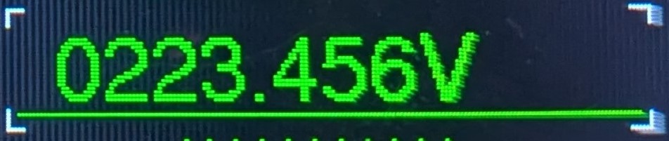
NumericControl | 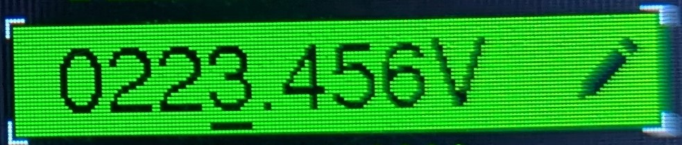
NumericControl in edit mode |
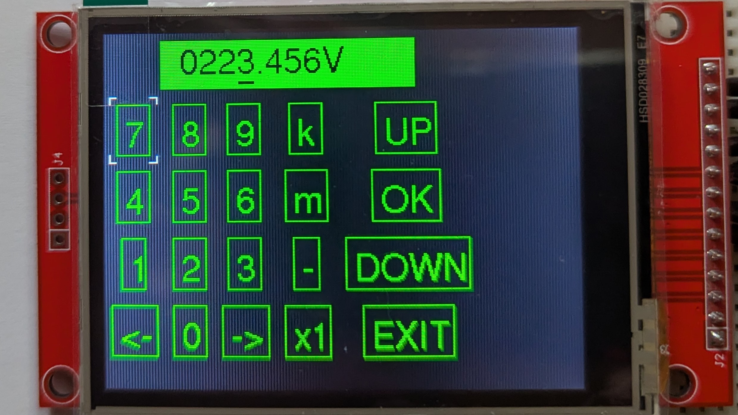
VirtualKeys
The VirtualKeys control can be used to emulate key presses via touch inputs. It displays one UI_Element that receives all emulated key presses and a matrix with many BoolControl elements to input key presses.
- Supports children: No
- Supported key inputs: The user inputs are internally redirected to the ContainerGrid that is managing the buttons.
- Supported touch inputs: The touch inputs are internally redirected to the ContainerGrid that is managing the buttons.
- Dynamic memory allocation (sum of the following sizes):
21 * sizeof(UIElement)(_grid._items)5 * sizeof(uint16_t)(_grid._initialRowHeights)5 * sizeof(uint16_t)(_grid._initialColumnWidths)5 * sizeof(uint16_t)(_grid._rowHeights)5 * sizeof(uint16_t)(_grid._columnWidths)21 * sizeof(GridItemConfig)(_grid._itemConfiguration)2 * sizeof(char)(_button0._buttonText)2 * sizeof(char)(_button1._buttonText)2 * sizeof(char)(_button2._buttonText)2 * sizeof(char)(_button3._buttonText)2 * sizeof(char)(_button4._buttonText)2 * sizeof(char)(_button5._buttonText)2 * sizeof(char)(_button6._buttonText)2 * sizeof(char)(_button7._buttonText)2 * sizeof(char)(_button8._buttonText)2 * sizeof(char)(_button9._buttonText)3 * sizeof(char)(_buttonLeft._buttonText)3 * sizeof(char)(_buttonRight._buttonText)2 * sizeof(char)(_buttonMilli._buttonText)2 * sizeof(char)(_buttonKilo._buttonText)3 * sizeof(char)(_buttonX1._buttonText)2 * sizeof(char)(_buttonMinus._buttonText)3 * sizeof(char)(_buttonUp._buttonText)3 * sizeof(char)(_buttonOk._buttonText)5 * sizeof(char)(_buttonDown._buttonText)5 * sizeof(char)(_buttonExitVirtualKeys._buttonText)